Looking at the US employment picture
Written by Jason on September 6, 2010Today, we’re introducing the USLabor dataset, which is the first of a number of planned sets that will provide insight into the United States as a whole. It contains over 190 different data series with monthly data on employment, unemployment, average hours worked, overtime hours, average hourly earnings, hiring, job openings, layoffs and population. Employment, average hours, average earnings, hiring, job openings and layoffs are further segmented by industry, while unemployment is further broken down into different period lengths. Some of this data goes as far back as 1939.
For the statistically-inclined, this set is a compilation of what we felt were the most commonly-used items found in The Employment Situation and JOLTS (Job Openings and Labor Turnover Survey).
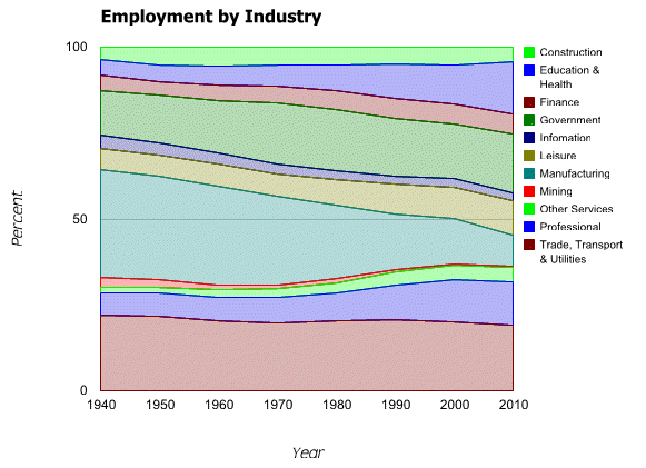
We’ll use the set to demonstrate stacked graphs. While we will use a stacked area graph to show the changing labor force mix over the last seventy years, note that bar and column graphs can also be stacked.

Clearly manufacturing employment as a proportion of the total has declined, while Education & Health, Professional and Government have grown.
We’re also going to compare the 2010 seasonal adjustments to nonfarm payrolls against 2009 and the historical averages. As you may remember from earlier posts, we’ve used aggregation functions to calculate rolling sums of failed bank assets and standard deviations of natural gas inventories. This time, we’ll generate a column chart that compares the nonfarm payroll seasonal adjustments of each of the first eight months of 2010 with those of 2009, and the mean adjustment in each of those months for the past five years.
Note that the above isn’t intended to be a rigorous analysis that adjusts for changes in the size of the workforce, holidays, etc. But what we do find interesting about it is the size of the differences between this year’s adjustments versus the historical ones. When the Employment Report comes out on the first Friday of each month, it is often a “market moving” event, with beats or misses to consensus estimates often measured in increments of ten- or twenty-thousand. Yet the seasonal adjustments regularly differ by more than twice that amount, either from year-to-year, or off the mean. When a forecaster doesn’t have a strong grasp of the seasonal adjustment process, it is easy to see how it can be a significant source of error.
Next, we’ll show an interactive table with the cumulative mix changes by starting year from 1940 through 2010, as well as a link to download the results to your computer. As always, we’ll also provide instructions on how to replicate these analyses yourself.
For instance, the 1940 row shows the mix changes from 1940 through 2010. Click on a column header to sort the results. Or, to download them, click here.
As a reference, for Employment Report data (employees):
- EmployeesNonfarm = EmployeesPrivate + EmployeesGovernment
- EmployeesNonfarm = EmployeesGoods + EmployeesServices
- EmployeesPrivate = EmployeesConstruction + EmployeesEducationAndHealth + EmployeesFinancial + EmployeesInformation + EmployeesLeisure + EmployeesMining + EmployeesOtherServices + EmployeesProfessional + EmployeesTradeTransportUtilities
As always, the filters and reports we used to create these examples follow.
Labor Force Mix Since 1940
Filter:
month(Date)=1(Selecting January, i.e., where the month equals 1)right(year(Date),1)=0(Selecting the years that end in zero. year(Date) returns the year, and right(year(Date)) returns the rightmost character of the year)
Report for area graph:
year(Date)(Used as the label on the axis.)EmployeesTradeTransportUtilities/EmployeesNonfarm*100(Formatted as a percentage, as are all the other columns after this one)EmployeesProfessional/EmployeesNonfarm*100EmployeesOtherServices/EmployeesNonfarm*100EmployeesMining/EmployeesNonfarm*100EmployeesManufacturing/EmployeesNonfarm*100EmployeesLeisure/EmployeesNonfarm*100EmployeesInformation/EmployeesNonfarm*100EmployeesGovernment/EmployeesNonfarm*100EmployeesFinancial/EmployeesNonfarm*100EmployeesEducationAndHealth/EmployeesNonfarm*100EmployeesConstruction/EmployeesNonfarm*100
Note that the columns are in reverse alphabetical order. The graph stacking process displays the first column at the bottom of the output, and we have chosen to list the categories in alphabetical order on the graph. We chose the “Area” graph, and the stacking option is the last item on the “Options” tab within the graph settings window. All columns, other than the year(Date) are chosen to be graphed as data series.
Report for table with cumulative changes (uses same filter):
year(Date)lookup(EmployeesConstruction,0,Date,"2010-01-01")/lookup(EmployeesNonfarm,0,Date,"2010-01-01")*100-EmployeesConstruction/EmployeesNonfarm*100(Construction mix at January 1, 2010 minus construction mix in the year of the row)lookup(EmployeesEducationAndHealth,0,Date,"2010-01-01")/lookup(EmployeesNonfarm,0,Date,"2010-01-01")*100-EmployeesEducationAndHealth/EmployeesNonfarm*100lookup(EmployeesFinance,0,Date,"2010-01-01")/lookup(EmployeesNonfarm,0,Date,"2010-01-01")*100-EmployeesFinance/EmployeesNonfarm*100lookup(EmployeesGovernment,0,Date,"2010-01-01")/lookup(EmployeesNonfarm,0,Date,"2010-01-01")*100-EmployeesGovernment/EmployeesNonfarm*100lookup(EmployeesInformation,0,Date,"2010-01-01")/lookup(EmployeesNonfarm,0,Date,"2010-01-01")*100-EmployeesInformation/EmployeesNonfarm*100lookup(EmployeesLeisure,0,Date,"2010-01-01")/lookup(EmployeesNonfarm,0,Date,"2010-01-01")*100-EmployeesLeisure/EmployeesNonfarm*100lookup(EmployeesManufacturing,0,Date,"2010-01-01")/lookup(EmployeesNonfarm,0,Date,"2010-01-01")*100-EmployeesManufacturing/EmployeesNonfarm*100lookup(EmployeesMining,0,Date,"2010-01-01")/lookup(EmployeesNonfarm,0,Date,"2010-01-01")*100-EmployeesMining/EmployeesNonfarm*100lookup(EmployeesOtherServices,0,Date,"2010-01-01")/lookup(EmployeesNonfarm,0,Date,"2010-01-01")*100-EmployeesOtherServices/EmployeesNonfarm*100lookup(EmployeesProfessional,0,Date,"2010-01-01")/lookup(EmployeesNonfarm,0,Date,"2010-01-01")*100-EmployeesProfessional/EmployeesNonfarm*100lookup(EmployeesTradeTransportUtilities,0,Date,"2010-01-01")/lookup(EmployeesNonfarm,0,Date,"2010-01-01")*100-EmployeesTradeTransportUtilities/EmployeesNonfarm*100
The lookup function is a very useful one – it is similar to the one found in spreadsheet applications, and allows the user to refer to a value based upon the value of a unique key. Above, we are specifically retrieving the number of employees in January 2010 in each column.
Seasonal Adjustments Graph
Filter:
Date>="January 1, 2006"month(Date)<=8(Select January though August)
Report:
month(Date)(select sort ascending button to keep the months in chronological order when graphing)monthname(Date)lookup(EmployeesNonfarm,0,Date,concat("2010-",month(Date),"-01"))-lookup(EmployeesNonfarmNSA,0,Date,concat("2010-",month(Date),"-01"))lookup(EmployeesNonfarm,0,Date,concat("2009-",month(Date),"-01"))-lookup(EmployeesNonfarmNSA,0,Date,concat("2009-",month(Date),"-01"))rollup_mean(EmployeesNonfarm-EmployeesNonfarmNSA,0,month(Date))(aggregates the seasonal adjustments from the filter output by month and calculates their mean, using the month(Date))
We will need to summarize the output by month(Date) so that each row in our output covers a single month. You might try running the report without the summary - the values in the last three columns will be the same in each month, but there will be 40 rows of output (5 years worth) instead of 8. We summarize it to clean up the output.
To chart the output, we'll use a column graph, with the monthname(Date) column as the x-axis label. The final three columns should be selected for display under "Available Data Series".
In our example, we further improved the default formatting of the numbers on the output, as well as customizing the labels and colors of the graph. The help section relating to filters and reports provides assistance in this area.


