Analyzing time series using FDIC bank failure data
Written by Jason on August 18, 2010In a prior article, we examined the aggregate size of US bank failures since 2005. In this post, we’ll examine the cost to the FDIC over time. We’ll start with the same filter as in this article and, for a report, we will use the following:
EffectiveDateback_sum(TotalAssets,90,-1,EffectiveDate)(sum all of the assets in the trailing 84 days, including today – i.e., 13 weeks of data – 7*13-1)back_sum(TotalAssets,181,-1,EffectiveDate)(prior 26 weeks)back_sum(TotalAssets,363,-1,EffectiveDate)(prior 52 weeks)
Summarize the report by EffectiveDate to consolidate any days with multiple failures into a single day for graphing purposes. We will use a “Scatter” graph to show this data, as the failure dates are erratically spaced – there are no failures in 2005 and 2006, and few in 2007 – as we would expect. A line graph would provide equal amounts of space for each data point, while the scatter graph takes the elapsing time nature of the data series into consideration.
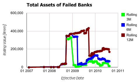
As for the graph settings, we set EffectiveDate to be used as the x-axis. Each of the other three items will be used in the available series for plotting purposes and provide the corresponding y-axis values. Generating our output, we get:

It’s a bit of an odd shape, having a large discontinuity in the middle of the data series. Running a simple report, we find that Washington Mutual is driving this spike (Tutorial #1 provides the background necessary to accomplish this). To get a better sense of the pattern, and not allow an outlying data point to unduly distort a trend, we add a third item to the filter:
TotalAssets<=200000000(Banks with less than $200 billion in assets)
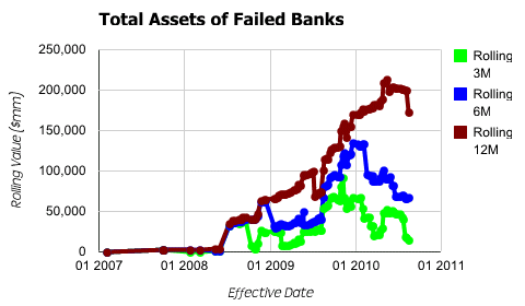
This item only eliminates WaMu, yet clears up the pattern considerably.

The historical trends are much more apparent now that the outlier has been removed.


