A trend monitoring dashboard
Written by Jason on August 19, 2010Sometimes, we’re not always interested in the recent value of an item (at least at the outset), as much as getting a quick overview of the recent trends. Anything that lends itself to be spoken of as a growth rate falls into this category – e.g., stock or commodity prices (prices of anything, really), network traffic, capacity utilization, etc. Tables do a great job in presenting numerical changes over specific time periods, but aren’t quick to glance at and get the overview we’re looking for.
Traditional line or scatter charts help, but they overlay the data on top of each other, and are difficult to glance at and see patterns when they’re busy. We have another solution – sparklines. They’ll plot each data series separately, allowing you to see recent activity at a glance.
Today, we’ll create a quick dashboard to monitor the storage levels of various energy products in the United States, and we’ll use the EIAWeeklyStorage Group; users can subscribe to it for free.
We’re going to compare inventory levels of seven different energy products to their five-year averages over that span, and we’ll adjust for seasonality by comparing the data to the average of the same weeks in all years – e.g., compare the level at the 3rd week in 2007 to the average of the 3rd week in 2006, 2007, 2008, 2009 and 2010.
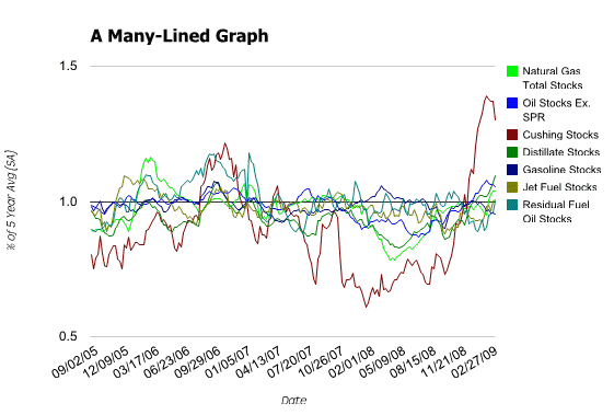
A traditional line graph would look like this:

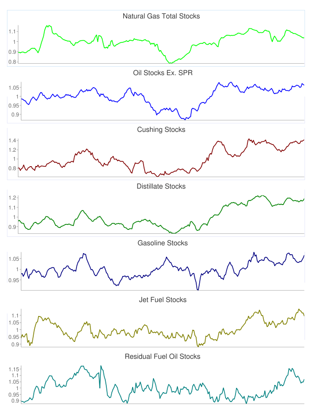
It’s better than a table for recognizing patterns, but it takes effort to read and the lines are cluttered together. Let’s take a look at the same analysis using sparklines:

Very easy to see how each different product is trending, and each is clearly labeled as well.
These instructions assume that the reader is familiar with the Tuhunga basics of creating filters and reports, building simple formulas, and creating graphs. These concepts (and more) are all covered in Tutorial #1.
The filter is simplicity itself – we want to review the prior five years of data no matter when the filter is used, so we specify it in one line:
Date>=subyear(now(),5)
The columns in the report are the same for each graph type; only the graph settings change. The columns are:
DateNGTotalStorage/rollup_mean(NGTotalStorage,0,week(Date,2))(divide the current NG level by the mean over the last five years in the same week – Tutorial #1 also reviews the behavior of the rollup_ series of functions)OilStocksExSPR/rollup_mean(OilStocksExSPR,0,week(Date,2))CushingStocks/rollup_mean(CushingStocks,0,week(Date,2))DistillateStocks/rollup_mean(DistillateStocks,0,week(Date,2))GasolineStocks/rollup_mean(GasolineStocks,0,week(Date,2))JetFuelStocks/rollup_mean(JetFuelStocks,0,week(Date,2))ResidualFuelOilStocks/rollup_mean(ResidualFuelOilStocks,0,week(Date,2))
Enable graph output, and select Sparklines as the type. Select the series to plot, and then generate the output. You now have a dashboard that you can update as often as you like, or if you’ve got a membership that supports analysis monitoring, get Tuhunga to keep it updated for you.


