Bubble visualizations and other charting enhancements
Written by Jason on June 18, 2012Today, we're announcing the availability of bubble charts, which brings the total visualization count to 18. Not enough for you? Well, if you were to count the different variants, you'd reach 34. These, of course, include all of the standard types that you'd expect, and more.
That's not all though - we're also introducing some enhancements to existing charts as well.
First, the bubble charts. They can be set up to display four independent metrics (x-axis, y-axis, bubble size and bubble color) or you can define series and plot them individually as different colors, while retaining the other three degrees of freedom (as shown below).
This is an example of the arrival delays at Toronto's main airport by carrier, where the size of the bubble is proportional to the average delay of a delayed flight. The chart is logarithmic to compensate for Air Canada's strong presence - otherwise all the other bubbles would be concentrated in the bottom left corner.
Some of the other chart enhancements include:
- The fast versions of the area and column charts now support stacking (the regular ones always did).
- Reversible axes on most chart types.
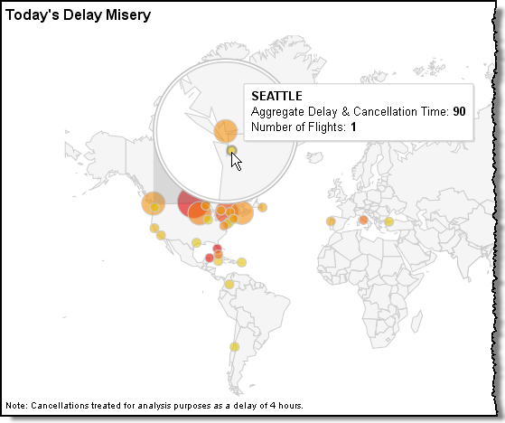
- Geo maps now support either markers or regions.


