Commodity prices and candlestick charts
Written by Jason on September 6, 2011We'd like to highlight a recently arrived dataset of commodity prices dating back to the 60s. Not only does it contain the usual suspects like the energy and metals complexes, but some less commonly seen items like chicken, fertilizer components, and plywood. This dataset is available at no additional charge to all users.
We're also going to show you a relatively new addition to our visualization capabilities by demonstrating the candlestick chart by using this dataset. We'll examine the ratio of coal and LNG prices, and normalize for their heating capacity. While not exactly the cost that a Japanese generator would face (the prices lack transport costs, and no credit is given for power plant efficiency differences to name two), it seems like an interesting metric to examine over time.
As is our custom, read on to see how we created this chart.
In order to build this chart, if you haven't already, you'll need to add the "CommodityPricesMonthly" dataset to your account. It may be found under the "Industry, Trade and Services" category of the Subscribe tab.
Next, let's create a simple filter to narrow down the date range. We used:
Date>="Jan 1, 1990"Date<"Jan 1, 2011"
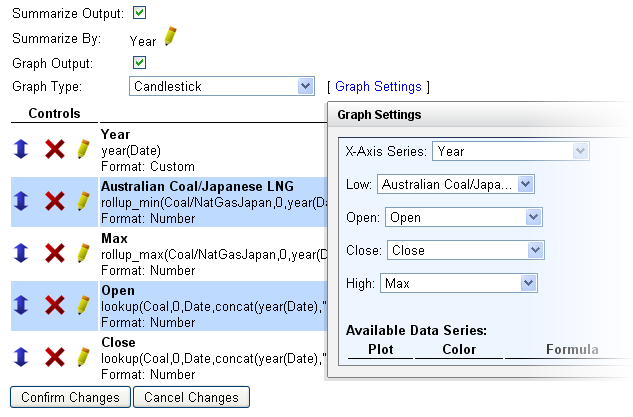
The candlestick chart requires five values - an x-axis, and the series open, close, minimum and maximum for each period of the candlestick. Because the data we have is monthly, we'll need to compute each of these series items in the report.
year(Date)
(We will summarize the data by year.)rollup_min(Coal/NatGasJapan,0,year(Date))/25
(The minimum coal/LNG ratio in the year, divided by 25 to adjust for energy content. The label of the minimum line is the one used when a user hovers over a data point.)rollup_max(Coal/NatGasJapan,0,year(Date))/25
(The maximum ratio.)lookup(Coal,0,Date,concat(year(Date),"-01-01"))/lookup(NatGasJapan,0,Date,concat(year(Date),"-01-01"))/25
(The opening ratio in January of each year, looking up the prices of each at that time by building the date by hand to look like 2005-01-01 and the like.)lookup(Coal,0,Date,concat(year(Date),"-12-01"))/lookup(NatGasJapan,0,Date,concat(year(Date),"-12-01"))/25
(The closing ratio in December.)
Summarize the report by year (the first line of the report) and set the graph type to candlestick. The five formulas we entered are used to fill in the required five values for this visualization. A screenshot is shown below.

That's all that's needed. You can modify the formatting to suit your needs. Note that the y-axis on the chart shown here has a custom formatting of 0% so that the ratio is shown as a percentage, and the year has a custom format of ":#,####" to stop a comma from appearing between the first and second digit (added another number sign to the three that were already to the right of the comma under the number format, and removed the decimal).


