Relative commodity prices in recessions, part I
Written by Jason on September 12, 2011This entry will deal more with presentation than analysis. Not only are we dedicated to bringing you the best analysis tools, but also to making your results look great as well.
We'll use the commodity pricing data we introduced in the prior post, and we'll plot the price of aluminum in terms of gold. We'll also add recession bars for the US and Japan using the (appropriately named) Recession dataset, which is linked to the commodity price dataset by common dates.
In the next part of this topic, we'll look at rates of change with an eye to performance in and out of recession.
Continue reading to get the details on how we formatted the chart. It only takes a minute to implement.
You can watch our video to see how we created the analysis To summarize its contents here, create a filter and report with the following parameters:
Filter
Date>="Jan 1, 1960"
Report
DateRecession_USRecession_JapanAluminum/Gold
Plot the report as a Combo (Fast) type, with the Date as the x-axis and the other three series checked. The two recession series should be plotted as areas against the right-axis (line width and point size of 0) while the Aluminum/Gold ratio will be a line against the left-axis (line width of 3 and point size of 0).
Here are the seven things we'll change from the default chart settings:
- Add a title
- Add formatting to the left y-axis
- Set the right y-axis limits to have shading all the way up the chart
- Hide the right y-axis labels
- Format the x-axis
- Clean up the series labels and show them on a legend
- Add a footnote
Let's begin:
- Add a title
We do this in the Labels section of the Graph Settings window: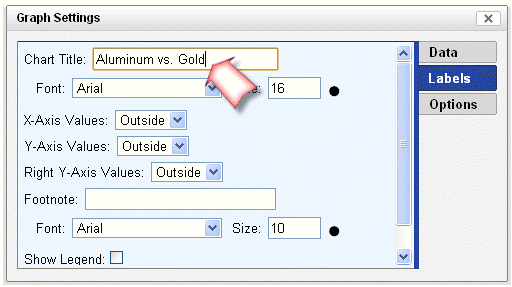
- Add formatting to the left y-axis
We do this in the Options section of the Graph Settings window, and we can copy and paste a format we've specified for a given column in the report. We've used a standard "Number" format, with the second decimal replaced by an "x" here. The #,### acts like it would in Excel and indicates commas should be placed every three digits, while the .0 indicates a single decimal place.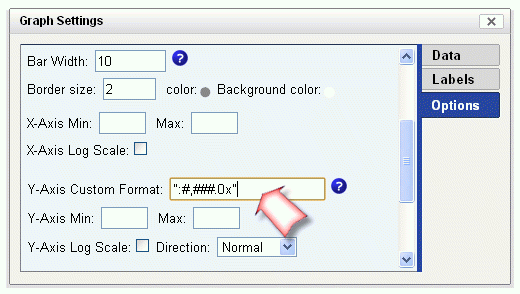
- Set the right y-axis limits to have shading all the way up the chart
We'll stay in the Options section of the Graph Settings window: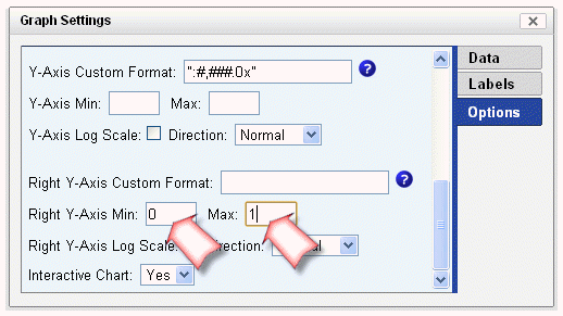
- Hide the right y-axis labels
Let's go back to the Labels section of the Graph Settings window to set the right y-axis values position: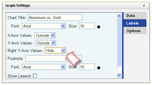
- Format the x-axis
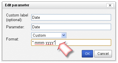
We'll exit the settings window and click the pencil icon beside the Date, which is our x-axis. Since we're looking at monthly data, we'll remove the day. Select the Long Date format, click edit, and remove the "d" (for the day of the month) from the format.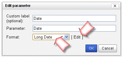
- Clean up the series labels and show them on a legend
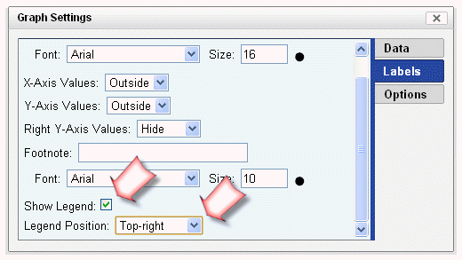
Let's enable and position the legend. Return to the Graph Settings window, and on the Labels tab, check the "Show Legend" box, and use the dropdown menu immediately beneath it to position it.
- Add a footnote
Still on the settings window, we'll go up a couple of lines from where we enabled the legend in the prior step and add a footnote.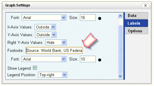
That's it. As always, if you have any questions or comments, please let us know.


