Interactive dashboards have arrived
Written by Jason on June 10, 2013You might already have seen some of the interactive dashboard previews we've put out. Today, we're pleased to officially roll out this capability to our users.
You can now create user-driven dashboards such as the one below (it plots sequential changes in US durable goods orders vs copper prices -- used as a proxy for raw inputs). In this example, anyone using the dashboard can explore the data and control the years and months shown on the chart independently (to examine seasonal trends), as well as the actual copper price. The table beneath summarizes the selected data by year.
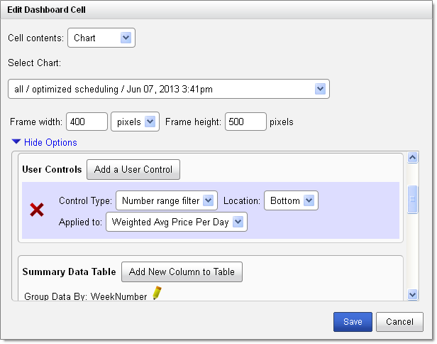
Not only is this functionality extremely useful, it's quick to implement as well. It took us less than two minutes to add the controls and summary table.
You can add these controls and summaries to the standard charts (e.g., line, column, area, combo) as well as maps. We support the following control types: number ranges, date ranges, category selectors, and text searches.
Controls apply to one chart at a time, so users can interact with multiple charts independently on a single dashboard. The available options will automatically appear in your dashboard editor on a chart-by-chart basis.

As always, we're happy to answer any questions you have.
Tags: features


