Open data translates into business insight
Written by Jason on October 10, 2013UPDATED October 15, 2013
Inspired by GTEC 2013's Open Data session yesterday, we've got a three dataset mashup to share with you.
We'll overlay the number of private aircraft registered in Canada by the first three letters of the regitrant's postal code.
For data sources, we used Transport Canada's Civil Aircraft Registry, Statistics Canada's 2011 census population data and Canada Post's Forward Sorting Area boundaries (via StatCan).
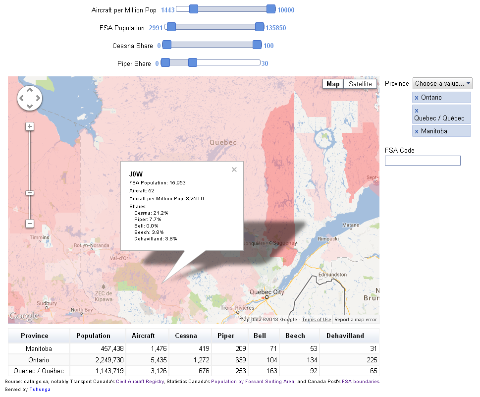
The underlying data is a few megabytes, so rather than embedding the interactive visualization directly on this page, please click on the image below to launch it in a new window.
The regional colouring on the map is determined by the number of aircraft per population -- the redder the region, the higher the concentration. Clicking on a region brings up additional detail, including market shares for the top five manufacturers in Canada.
This is just one example of how open data can help businesses - an aircraft manufacturer or dealer could use this as a tool to help them look for potential new markets.
Keep reading to learn how we implemented this, as well as some of the hiccups we encountered.
From start to finish, this interactive dashboard took about six hours to implement, broken down as follows:
| Task | Time |
|---|---|
| Find raw data | 2 hours |
| Simplify and convert FSA boundaries | 3 hours |
| Import data | 20 minutes |
| Create draft dashboard | 10 minutes |
| Iterate dashboard layout/formatting | 30 minutes |
It's worth noting that over 80% of the time spent was on finding or converting data and less than 20% was on the actual analysis. This type of split is common when working with data from various sources, and in our opinion, represents great progress - it's much better to have data in a less-than-optimal format than not have data at all.
Let's expand on each one of these areas.
Find raw data
At the outset, there wasn't a specific idea for this open data demo, but there were two goals:
- Use data published by organizations represented at the GTEC 2013 Open Data event
- Combine data from multiple sources in an interactive dashboard
There's a ton of good data on the data.gc.ca portal -- so much so that Jason got distracted more than once by the range of data and forgot about building this demo! Ultimately though, the three selected datasets were chosen because they could be organized around a standard element (Canada Post's FSA) and they either contained the FSA directly (Statistics Canada and Canada Post datasets) or could be derived from the underlying data (Transport Canada).
Simplify and convert FSA boundaries
There were three challenges with the FSA boundaries:
- The boundaries are extremely detailed - much more than is required for our use case and using the full detail would increase the map load/render time.
- The boundaries are in SHP format, while Tuhunga uses KML for it's built-in mapping capability.
- The boundaries gave our usual SHP-to-KML converter application indigestion.
High detail is a positive in geometric shapes, but at 35 megabytes in SHP format, any user wanting to view the map would need to download and render this data. MapShaper was used to simplify the boundaries down to about 2% of the original complexity while preventing shape removal. For this type of application, even removing 98% of the shape's complexity still provides more than enough detail to generate a useful map (as shown above!).
After simplification, the SHP-formatted boundaries still need to be converted to KML. Our usual converter had a problem with the file, and after a dozen or so attempts we abandoned it (not sure why it wasn't working) and tracked down another one that worked beautifully.
Import data
Each data source was imported into a separate dataset, and unique keys were assigned to each - FSA code for the Canada Post and Statistics Canada data, and aircraft mark for Transport Canada. The two files in the aircraft registery were imported separately into the same dataset and the FSA code for each owner was generated using Tuhunga data transformations (this is an Enterprise-class feature) from the postal code provided.
The net impact of storing both the aircraft data and owner data in a single dataset was to retain address information for a single owner, even if the plane had multiple owners. Multiple owners could have been retained if they were stored in two different datasets, but upon a cursory examination of the data, the vast majority of joint owners had the same mailing address, so we elected for a simpler approach (after all, we're trying to explain what we did in as few words as possible - if you'd like to know how to replicate this dashboard with joint owners, please get in touch).
The FSA boundaries and census data, each with the FSA code as the unique key, were linked to the aircraft registry FSA code to enable seamless analysis amongst all three datasets.
Create draft dashboard & iterate layout/formatting
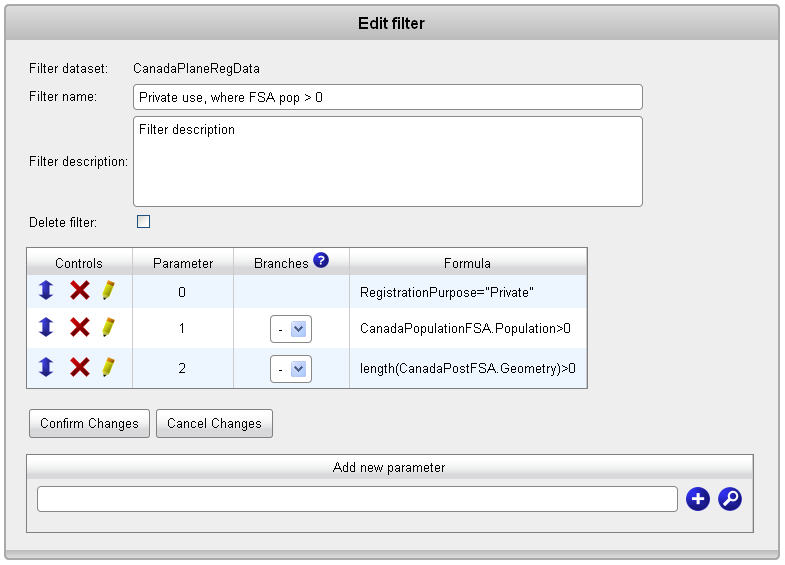
The filter selects private planes located in FSAs that have non-zero population and a valid FSA boundary (seventeen FSAs did not have boundaries provided in the raw source file).

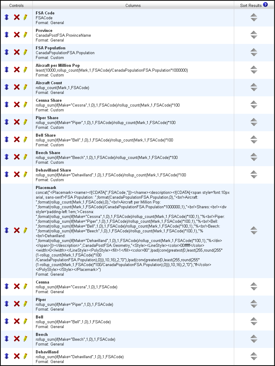
The report went through a few variants, but ultimately contained the FSA code and associated population, the province, the number of aircraft in each FSA and aircraft per million population, the numbers and shares of the top five vendors in Canada, and a custom KML placemark, which allows a user to fully customize icons, lines and polygons on a map (80% of the placemark text below relates to its custom info window). We used the custom KML placemark with the KML-custom map type, and the rest of the items are used as part of the dashboard. The report columns are shown below:

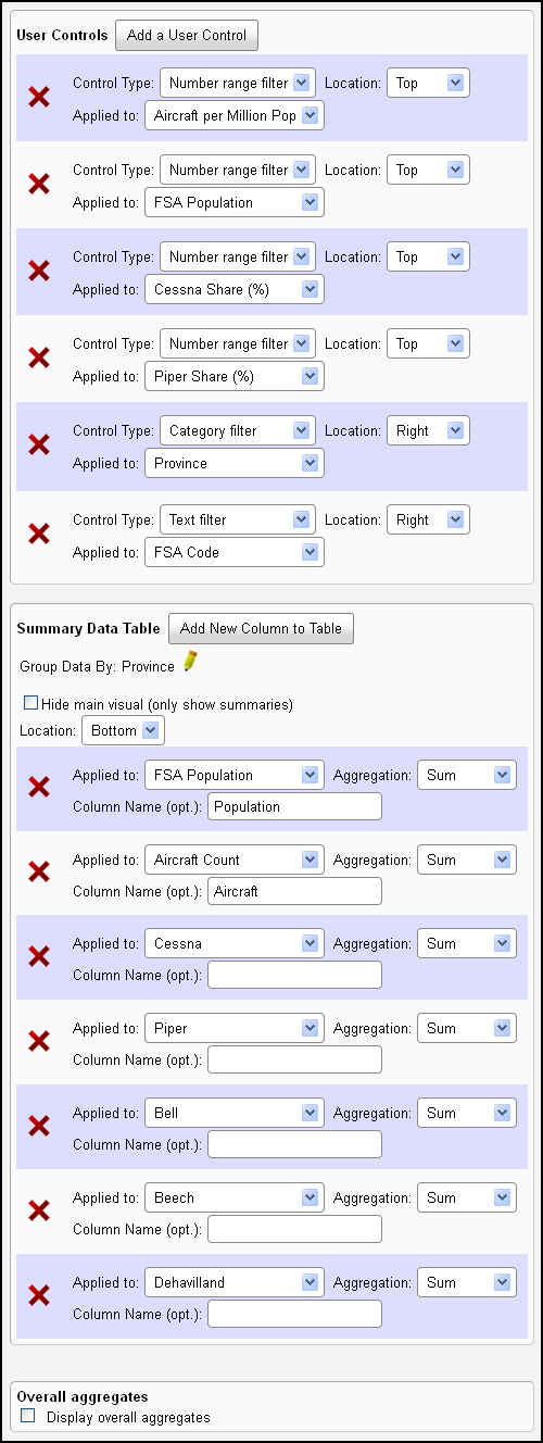
Finally, we created a dashboard that contained our map, user controls to interactively select portions of the filtered data and a table that summarizes the selected data. The user controls and summary table settings are shown below.

If you have any questions about anything we've shown here, please get in touch.
Tags: examples


