Using standard deviation to find uncommon events
Written by Jason on August 21, 2010In our previous post, we created a sparkline dashboard that let us monitor a large number of data series at a glance. Today, we’ll increase the analysis a notch by comparing natural gas inventories not only to their five-year mean, but also their standard deviation, with an eye to finding when inventories were outside one standard deviation from the mean.
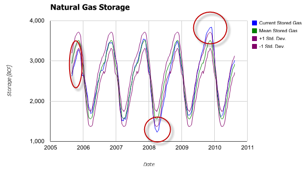
As before, we’ll start with a traditional scatter graph containing the current price, the five-year mean computed by week, and a +/- 1 standard deviation envelope around the mean.

The graph clearly shows the cyclical nature of the inventory levels. However, it’s less obvious when the levels go outside the envelope we’ve drawn – we’ve highlighted the three significant occurrences.
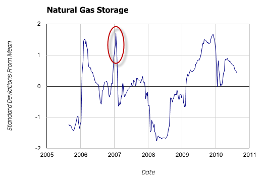
Might there be a better way to find and depict these relatively uncommon events? Yes – we’ll normalize the data so we only need to plot a single series of current distance from mean in units of standard deviation – and avoid cluttering the graph.

The deviations are now quite clear. However, more importantly, we can now see a fourth spike outside our +/- 1 standard deviation window that was completely obscured in the first graph.
Tuhunga is useful in helping to find and display both trends, and trend aberrations. However, where Tuhunga can really improve your productivity is by building a filter to extract these uncommon events and then having it run automatically. For members with automated monitoring, Tuhunga will automatically run your filter, and when new data that meets your criteria is available, it will generate a report and email it to you. Not only does automated monitoring save you time by freeing you from manual updates, it also allows you to search for trends and events that you normally wouldn’t look for because there wasn’t enough time in the day. Tutorial #3, Part II covers this feature.
As always, these instructions assume basic familiarity with Tuhunga. If you haven’t completed Tutorial #1, we suggest you do so prior to continuing.
Our filter is essentially the same one we used in the prior post, except we adjust our week count. Because some years have 53 weeks (due to the convention of starting weeks on Sunday or Monday, depending on the option chosen in the week() function), we’re going to eliminate week 53 from our analysis. Only one of the five years in this example has a week 53, and it distorts the graph, as by definition, the standard deviation of a single data point is not meaningful.
Filter:
Date>=subyear(now(),5)week(Date,2)<=52
First Report:
DateNGTotalStorage(current stored gas)rollup_mean(NGTotalStorage,0,week(Date,2))(mean stored gas, grouped by week number for averaging)rollup_mean(NGTotalStorage,0,week(Date,2))+rollup_std_sam(NGTotalStorage,0,week(Date,2))(+1 standard deviation envelope)rollup_mean(NGTotalStorage,0,week(Date,2))-rollup_std_sam(NGTotalStorage,0,week(Date,2))(-1 standard deviation envelope)
We use a scatter graph, with Date as the x-axis. The other four columns are plotted. For a slight reduction in complexity, we make the colors of the two standard deviation envelope lines the same color by clicking on the color bullet. Given the number of data points, we set the point size to 0 and the line width to 1 under the options tab.
Second Report:
Date(NGTotalStorage-rollup_mean(NGTotalStorage,0,week(Date,2)))/rollup_std_sam(NGTotalStorage,0,week(Date,2))(current storage less mean storage, all divided by the standard deviation and consolidated by week number)
Again, we’ll use a scatter graph with Date as the x-axis and the other column as a plotted series. Under the options tab, we’ll make the same modifications as above (point size of zero, line width of one) and also fix the y-axis values from -2 to +2. Select the filter and report combination to run, and you’ve got your output.


