Inflation and personal income - what do the numbers tell us
Written by Jason on February 11, 2013Recently we helped a client understand the impact of nominal wage gains and inflation on the purchasing power of commodities. He was kind enough to allow us to share the results, which, quite frankly, surprised us.
What we did
We have reliable historical price data for a number of wholesale commodities, and we looked at the quantities that could be purchased by an American in either of these scenarios:
- had average disposable income
- worked a full-time minimum wage job
What we found
An American with average disposable income has had a significant increase in food+clothing-related purchasing power. Energy has gotten more expensive, with crude oil being the worst P.P. performer across all categories. The recent boom in US natural gas production has more than tripled purchasing power in only four years; however, on a five-year basis, it's still below the long-term average.
More surprisingly however (to us anyway), someone with a full-time minimum wage job has maintained roughly the same purchasing power as they would have had in the 1960s for food+clothing inputs.
Full details below.
| Average Disposable Income | Minimum Wage Job | |
| Food | ||
| Grains | ▲ | ▬ |
| Edible Oils | ▲ | ▬ |
| Fruit | ▲ | ▬ |
| Beef | ▲ | ▲ |
| Energy | ||
| Crude Oil | ▼ | ▼ |
| Natural Gas | ▼ | ▼ |
| Industrial Materials | ||
| Aluminum | ▲ | ▲ |
| Copper | ▼ | ▼ |
| Cotton | ▲ | ▲ |
| Rubber | ▬ | ▼ |
The comparisons above are being made between the 53 year average and the 5 year trailing average.
- ▲ is a >15% increase in purchasing power
- ▼ is a >15% decrease in purchasing power
- ▬ is in between
See the results
There are three measures on each chart, represented as follows:
- Dots - yearly data points
- Thick line - 5 year trailing average
- Thin horizontal line - average over the 53 year period
On to the charts, starting with food:
Next up, energy:
Keep reading...Now merge tables and charts EASILY
Written by Jason on January 17, 2013As promised about a month ago, we've rolled out the UI enhancement to let you merge multiple result sets together.
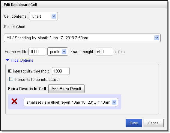
All you need to do is click the Add Extra Result button in the dashboard cell editor to get a list of all your result sets and select the one you want to add.

The one caveat is that you'll probably want to ensure your additional results' columns are in the same order as the primary table or chart, otherwise you may not get the output you're expecting.
Tags: features
New feature time! Merge tables and charts, even if you haven't joined the datasets!
Written by Jason on December 20, 2012This is such a useful feature, it's hard to believe we didn't have it earlier!
We've got a bit of a contrived example here to demonstrate. We took two datasets from NYC's open data site - one of them has geospatial coordinates for ~2000 subway entrances and the other has geospatial coordinates for ~2000 water fountains.
Within Tuhunga, we stored each in a different dataset. Because there was no common point of reference between the two (obviously subway entrances and fountains don't always go together), the datasets couldn't be linked. This meant that, until today, there was no way to plot them on the same map unless all the data was in the same dataset.
Now, you can - it's easy, and only requires a few seconds for you to implement. While it's not available yet in the UI (it will come early in 2013), the capability is ready to use now. So, we're making it available to you today if you want to do it manually (it's easy - trust us).
What can this be used for? Well, just like our unusual subway + fountain example, let's say you were looking for a site for a new restaurant and wanted to know where your potential competitors might be, you might have a dataset for all the McDonalds in an area and a separate one for all the Burger Kings.
If you wanted to see them on a single map, you used to need to merge the datasets yourself since there is no natural link between the two. Now, run your own filters and reports independently on each, and then plot the locations on the same map. You can even use custom icons for their respective logos.
Keep reading...Tags: features
Oracle isn't worth more than every other company in the world combined, and why XBRL isn't foolproof
Written by Jason on December 13, 2012We've been looking at XBRL for the last few weeks for the purposes of trying to capture some specific financial data from SEC filers. Getting data is reasonably straightforward. The challenge is getting consistently reliable data. Unfortunately for our purposes, commercial data vendors aren't providing all of the items that we find interesting.
We've made some progress, and are getting close to having something that is useful. But as with any large data collection, when thousands of different organizations are contributing to it, there are many different ways of doing things. And some things just slip through the cracks, like miskeyed dates (October 1st, 2012 entered as January 10th, 2012).
As an illustration of this, we're going to highlight an error from Oracle.
It's a great company, don't get us wrong, but it's not worth over 100 QUADRILLION dollars (that's a million billion dollars). Unfortunately, a blind reading of their most recent machine-readable XBRL quarterly filing with the SEC would leave you with that impression.
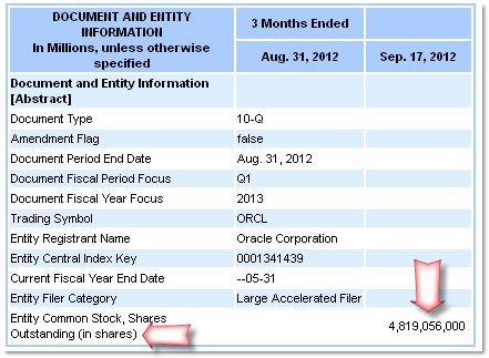
Using the XBRL viewer on sec.gov, everything looks reasonable with the summary page showing ~4.8 billion shares outstanding.

The XBRL filing is a different story though, where it's showing ~4.8 quadrillion shares outstanding. Multiply those 4.8 quadrillion shares by a share price in the low $30s as of this writing, and you're looking at a market cap of well over 100 quadrillion dollars.

In case you're wondering what the "decimals" attribute is used for, per the SEC's definition, it's "used to express the number of decimal places to which numbers have been rounded." This is not the same as saying the number should have a decimal place 6 spots to the left of where it actually is.
Whose software let this pass? Oracle's.

We don't mean to single out Oracle here. There are at least ten other companies that have the same error in the most recent quarter (we stopped counting at ten), and they're using software from three different vendors (none of them use Oracle). It's just that when the vendor of the software that made the filing has an error like this, it tells us that the tools themselves may be obscuring the actual data being represented in the name of making it easier for the human users. Most people we know don't want to see a 10 or 16 digit number with a lot of zeros at the end when you can round them to the thousands, millions, or even billions.
Also, it's extremely difficult to teach a computer to validate data against what humans would consider to be common sense. This is a computer science problem that is by no means limited to XBRL.
We're glad that XBRL is here, and that it's being used by SEC filers. We're just looking forward to the day where there won't be a need to do any sanity checks on the filings.
As a final note, until you spend a lot of time looking at raw data files, it's hard to fully appreciate the service that data aggregators (both commercial and government) provide when they scrub their numbers before distribution.
Sources:
Oracle XBRL filing using SEC viewer:
http://www.sec.gov/cgi-bin/viewer?action=view&cik=1341439&accession_number=0001193125-12-401697&xbrl_type=v
Oracle XBRL filing:
http://www.sec.gov/Archives/edgar/data/1341439/000119312512401697/orcl-20120831.xml
Now use Skydrive and Google Drive with Tuhunga
Written by Jason on November 15, 2012We all recognize that data is often stored in different locations because often it's the easiest way. Equally however, when you want to use data that is stored across these locations, the usability gaps become apparent and it's a challenge to integrate it all.
To make your life a little easier, we're continually trying to bridge these gaps by enabling you to capture and analyze data stored in as many places as possible, in as many formats as possible.
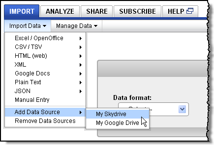
We're pleased to announce that Tuhunga can now access data stored on Skydrive accounts and on Google Drive accounts. Once you've authorized access, you can seamlessly use data located in these accounts with all the other data you already have in Tuhunga.
To set up these connections, just go to the Import tab and look under the Import Data menu to find the Add Data Source item. Select the type of account you want to access, and follow the two step confirmation process.

Tags: features
US campaign finance dashboard
Written by Jason on November 1, 2012The US election is now less than a week away, so we thought we take a look at some of the campaign finance data from the Federal Election Commission. We've pulled a series of tables and charts that we found interesting into the dashboard below
We're presenting our analyses in a mobile-optimized dashboard, which can function as a presentation aid like a slide deck, except you get the interactivity of our tables and charts as a bonus.
If you'd like to replicate this on your own, we've got step-by-step tutorials and help videos for your reference. Of course, we're here to help as well, so just get in touch if you'd like a helping hand.
Tags: examples


