Introducing our API
Written by Jason on November 18, 2011We're very pleased to announce our formal API. While we've had an informal one for a while, it was more cumbersome to use than we would have liked. Now, it's quite straightforward, and we've rolled out comprehensive documentation as well.
In summary, you can currently use the API to:
- Retrieve or download analysis results
- Download datasets
- List accessible result sets
- List queued dataset items (e.g., imports, exports, removals, duplications)
- List queued analysis items
- Modify queued imports and exports (e.g., change next run time, frequency, start & stop times)
- Modify queued analyses (e.g., change next run time, frequency, start & stop times)
We've got near-term plans to expand these capabilities, including being able to add new items to the dataset and analysis queues. (*** NEW DEVELOPMENT *** As of March 2012, you can use the API to add items to a dataset - stay tuned for the ability to queue new analyses.)
Get started by getting your API key in your user preferences. Please feel free to read more about the analysis API and dataset API.
We hope you find these capabilities useful.
New treemap features, as demonstrated by who's been buying lately
Written by Jason on October 31, 2011Following up on our recent mapping enhancements announcement, today we're going to review some of the new heatmap (aka treemap) features which can significantly enhance your visualization.
The big enhancements are:
- Depth support - trees can be up to four levels deep
- Custom messages - the box at the bottom can be used to provide additional information, and can be different for each element at each level
Let's take a quick look at an example where you can:
- Hover over an area to learn more about the selected item in the message box underneath the chart
- Left-click on a rectangle to descend a level and get a breakdown
- Right click to move up a level
This example summarizes certain insider trading activity since the recent market low in early October. Specifically, it shows all of the transactions that meet the following criteria:
- Transactions and filings that occurred between October 3rd and 28th, inclusive
- Officer transactions only - directors and other insiders are excluded
- The companies have officers buying at least $100k in aggregate over that period (so two $50k purchases by different people on different days would qualify the company, and then any officer transactions for that company - purchase or sale - would register)
We've implemented some custom sizing for the rectangles in this example - it's logarithmic and also takes into account the number of insiders and the number of companies in the industry, and weights purchases more heavily than sales. So you'll see that while large purchases (like the two officers at Opko Health in the surgical and medical instruments industry) remain prominent, there are three different companies in the state commercial banks industry that met our $100k officer purchase criteria, and is larger on the industry view.
Of course, you can scale items any way you choose through your formulas. You could scale them linearly by dollar amounts, number of participants, weighted by number of days from Oct 28th, or almost any other permutation you desire.
We set the color of the rectangle as the net number of officers that made purchases in the timeframe (number that made purchases less number that made sales). The more people that bought, the more green the rectangle at the industry and company level.
Hopefully this analysis is useful to you, and helps you understand what you can do with Tuhunga.
Tags: charts, examples, features
More mapping features
Written by Jason on October 28, 2011We're very pleased to announce our latest mapping improvements. In addition to the standard maps where addresses and coordinates are shown using red dots, you can now plot areas or custom icons on an interactive map. See below for an example of interactive areas where we look at solar installation permits in Ottawa (click on an area to see the details).
The areas were created using data from Ottawa's opendata site and the building permit information comes from the same site (Tuhunga screened for the word solar in the permit description).
We continue to add geographic data to our available datasets for your use. Of course, you can always use your own geographic data in KML format in addition to street addresses or latitude/longitude coordinates.
When plotting points, you can use the standard icon set or specify your own. In the following example, we're looking at water consumption in cities across Canada, and have set arbitrary cutoff points to create three categories. The consumption data for this map comes from Environment Canada.
We hope you find these new capabilities useful.
Announcing data table enhancements
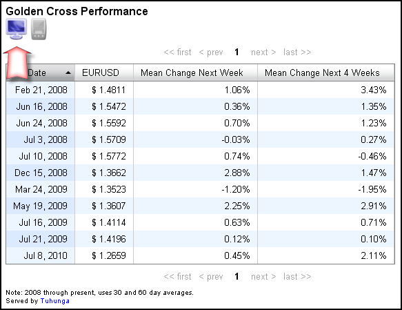
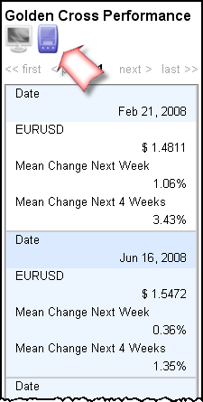
Written by Jason on October 11, 2011We're pleased to announce two enhancements to our data tables. The first enhancement is a new mobile display mode that is optimized for small screens.
Table in Regular Mode

Table in Mobile-Optimized Mode

You don't need to do anything special to enable this toggle button. However, if you want, you may disable the toggle and force the display into one mode or the other permanently, which is useful when you have a specific targeted audience, or your table is so wide that all users would benefit from a mobile view.
Go to the golden cross blog post to see this toggle in action.
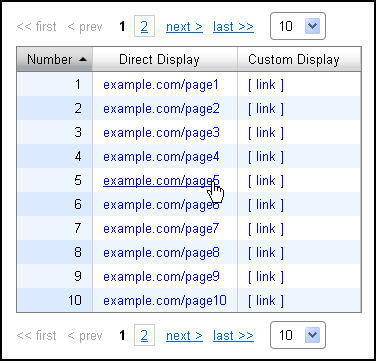
The second enhancement is hyperlink support within the table. You can now use links in tables to provide greater interactivity. For an improved display, the link display can also be formatted with custom text, as opposed to a longer URL, as seen below.

Read on to learn how to use these two enhancements in your own tables.
Keep reading...Relative commodity prices in recession, part II
Written by Jason on September 22, 2011Similar to the first part of this post, we're looking at the historical prices of aluminum and gold. However, this time, instead of looking at the ratio between the prices of the two, we'll examine each of their year-over-year changes.
Keep reading to learn how to compute rates of change over an arbitrary period (daily, weekly, monthly, etc., or custom measures like 58 days).
Keep reading...Tags: charts, datasets, examples
Relative commodity prices in recessions, part I
Written by Jason on September 12, 2011This entry will deal more with presentation than analysis. Not only are we dedicated to bringing you the best analysis tools, but also to making your results look great as well.
We'll use the commodity pricing data we introduced in the prior post, and we'll plot the price of aluminum in terms of gold. We'll also add recession bars for the US and Japan using the (appropriately named) Recession dataset, which is linked to the commodity price dataset by common dates.
In the next part of this topic, we'll look at rates of change with an eye to performance in and out of recession.
Continue reading to get the details on how we formatted the chart. It only takes a minute to implement.
Keep reading...Tags: charts, datasets, examples


