A trend monitoring dashboard
Written by Jason on August 19, 2010Sometimes, we’re not always interested in the recent value of an item (at least at the outset), as much as getting a quick overview of the recent trends. Anything that lends itself to be spoken of as a growth rate falls into this category – e.g., stock or commodity prices (prices of anything, really), network traffic, capacity utilization, etc. Tables do a great job in presenting numerical changes over specific time periods, but aren’t quick to glance at and get the overview we’re looking for.
Traditional line or scatter charts help, but they overlay the data on top of each other, and are difficult to glance at and see patterns when they’re busy. We have another solution – sparklines. They’ll plot each data series separately, allowing you to see recent activity at a glance.
Today, we’ll create a quick dashboard to monitor the storage levels of various energy products in the United States, and we’ll use the EIAWeeklyStorage Group; users can subscribe to it for free.
We’re going to compare inventory levels of seven different energy products to their five-year averages over that span, and we’ll adjust for seasonality by comparing the data to the average of the same weeks in all years – e.g., compare the level at the 3rd week in 2007 to the average of the 3rd week in 2006, 2007, 2008, 2009 and 2010.
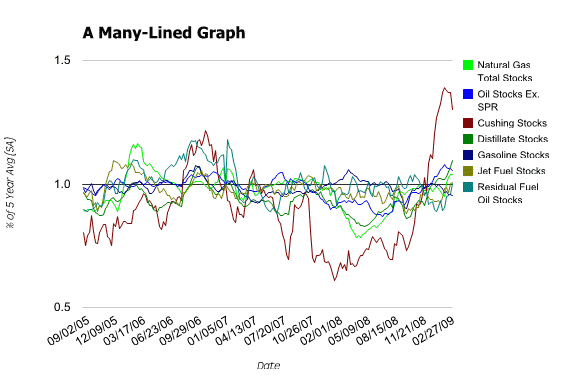
A traditional line graph would look like this:

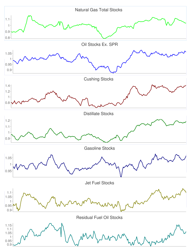
It’s better than a table for recognizing patterns, but it takes effort to read and the lines are cluttered together. Let’s take a look at the same analysis using sparklines:

Very easy to see how each different product is trending, and each is clearly labeled as well.
Keep reading...Tags: analysis, charts, examples
Analyzing time series using FDIC bank failure data
Written by Jason on August 18, 2010In a prior article, we examined the aggregate size of US bank failures since 2005. In this post, we’ll examine the cost to the FDIC over time. We’ll start with the same filter as in this article and, for a report, we will use the following:
EffectiveDateback_sum(TotalAssets,90,-1,EffectiveDate)(sum all of the assets in the trailing 84 days, including today – i.e., 13 weeks of data – 7*13-1)back_sum(TotalAssets,181,-1,EffectiveDate)(prior 26 weeks)back_sum(TotalAssets,363,-1,EffectiveDate)(prior 52 weeks)
Summarize the report by EffectiveDate to consolidate any days with multiple failures into a single day for graphing purposes. We will use a “Scatter” graph to show this data, as the failure dates are erratically spaced – there are no failures in 2005 and 2006, and few in 2007 – as we would expect. A line graph would provide equal amounts of space for each data point, while the scatter graph takes the elapsing time nature of the data series into consideration.
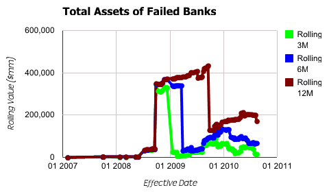
As for the graph settings, we set EffectiveDate to be used as the x-axis. Each of the other three items will be used in the available series for plotting purposes and provide the corresponding y-axis values. Generating our output, we get:

It’s a bit of an odd shape, having a large discontinuity in the middle of the data series. Running a simple report, we find that Washington Mutual is driving this spike (Tutorial #1 provides the background necessary to accomplish this). To get a better sense of the pattern, and not allow an outlying data point to unduly distort a trend, we add a third item to the filter:
TotalAssets<=200000000(Banks with less than $200 billion in assets)
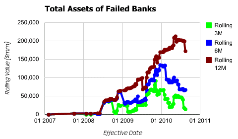
This item only eliminates WaMu, yet clears up the pattern considerably.

The historical trends are much more apparent now that the outlier has been removed.
Tags: analysis, charts, examples
Visualize financial data geographically
Written by Jason on August 17, 2010We’re always adding new datasets, and today we’ll highlight one of our most recent – a list of US bank failures (which is always kept updated, of course). Rather than listing the banks in a table, we’ll use an intensity map to quickly determine where the problem banks have been headquartered.
We’re going to show the results in this example by their aggregate dollar size in three different categories, but you could easily replicate this analysis to show them by number, or over a different time period, or in almost innumerable other ways.
With the tab interface at the top of the map, we can quickly look through to see the magnitude of the failures by asset size, deposit base, and estimated cost to the FDIC. California and Nevada are clearly the states with the largest bank failures by size.
This isn’t to say however, that the chart will always tell the whole story. If we looked at the results in a table, we would see that Washington Mutual dominates the assets and deposits – it accounts for 25% of the total assets and 20% of the total deposits, while IndyMac was the largest single loss and was 2.2 times the size of the second largest. We’ll demonstrate one way to deal with outliers in a followup post examining time series analysis.
One of the things that we think makes Tuhunga different is its ability to keep reports updated automatically. We’ve configured the graph below to be automatically updated every Monday and Tuesday afternoon at 6pm, and any changes in the underlying FDIC data set will be reflected here.
If you’d like to embed this chart on your own web page, you may use the following HTML:
<iframe src="http://app.tuhunga.com/embedchart?keysr=c88083c39a340add" frameborder=0 width=100% height=380px></iframe>
Building this analysis from start to finish takes about five minutes.
Keep reading...Tags: analysis, charts, examples
Stop watching FX swings
Written by Jason on August 14, 2010Repetitive, yet simple, tasks are often some of the most annoying – like waiting in a checkout line at the grocery store. They take up valuable time that could be better used elsewhere. At the end of the task though, you’ve gotten something accomplished – you have your groceries. Would you be more frustrated if you waited in the line, yet only got to purchase items 10% of the time?
This isn’t a hypothetical question – it happens all the time when analyzing data. There are many kinds of analysis that demand frequent, repetitive tasks to keep them updated. However, unless certain (and uncommon) conditions are met, no further action will be taken. It seems like this is an area that is ripe for automation.
Tuhunga can significantly improve your productivity in these kinds of scenarios. Let’s take a foreign exchange example where your company is based in the US, and sells in Europe. You want to make sure your prices are competitive with local European vendors, but want to maximize your profits without losing market share. The biggest short-term factor is the exchange rate between the US dollar and the Euro.
Both the absolute exchange rate and how quickly it has changed over the last week and month are important to you. If the Euro is $1.30 today, you know you are competitive down to a rate of $1.20, and at $1.40 you can raise your prices again, but you also want to know if the exchange rate moves 4% in a week or 6% in two weeks.
Today, you track these figures by entering them into a spreadsheet daily. When the rate meets one of the four criteria listed above, you spend an hour generating a comprehensive currency report that not only covers the Euro, but other major currencies as well. It’s a simple task that normally only takes 5 minutes a day. But add up those minutes, plus the time generating the report, and you’ve spent almost 40 hours per year!
Tuhunga will handle all of the mundane details for you – getting the exchange rates, emailing you when any of your criteria are met, and automatically sending you a customized and updated report like the one below.
Click the header to sort by a different column.
If you’re interested in building your own, check out our Tutorial #3, which steps through the process of creating reports that are automatically generated when a filter’s criteria are met.
Tags: analysis, examples, tables


