Bubble visualizations and other charting enhancements
Written by Jason on June 18, 2012Today, we're announcing the availability of bubble charts, which brings the total visualization count to 18. Not enough for you? Well, if you were to count the different variants, you'd reach 34. These, of course, include all of the standard types that you'd expect, and more.
That's not all though - we're also introducing some enhancements to existing charts as well.
First, the bubble charts. They can be set up to display four independent metrics (x-axis, y-axis, bubble size and bubble color) or you can define series and plot them individually as different colors, while retaining the other three degrees of freedom (as shown below).
This is an example of the arrival delays at Toronto's main airport by carrier, where the size of the bubble is proportional to the average delay of a delayed flight. The chart is logarithmic to compensate for Air Canada's strong presence - otherwise all the other bubbles would be concentrated in the bottom left corner.
Some of the other chart enhancements include:
- The fast versions of the area and column charts now support stacking (the regular ones always did).
- Reversible axes on most chart types.
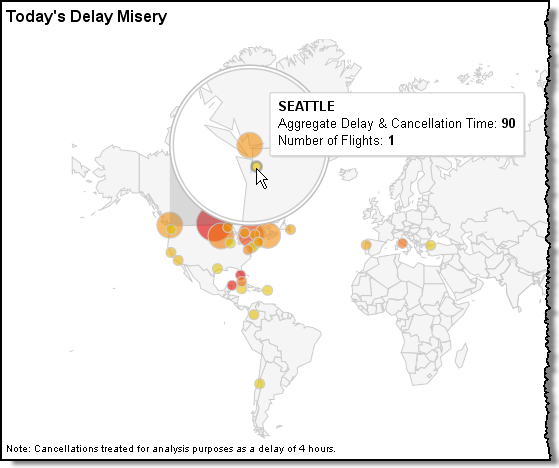
- Geo maps now support either markers or regions.
Building an automated alert system
Written by Jason on June 9, 2012Tired of running reports and getting long lists of results with lots of repetition? Tuhunga can help. By running incremental filters, you only get the results that you haven't seen before or, if you prefer, see the results that used to meet your criteria but no longer do.
When you combine incremental filtering with Tuhunga's automated data capture and results generation, you have a comprehensive system that monitors data and alerts you when there are results you care about.
Once you've set up the filter and report you want to use, you can set up this kind of monitor in about one minute.
Just as you would for any results, go to the Analyze tab, Configure section.
-
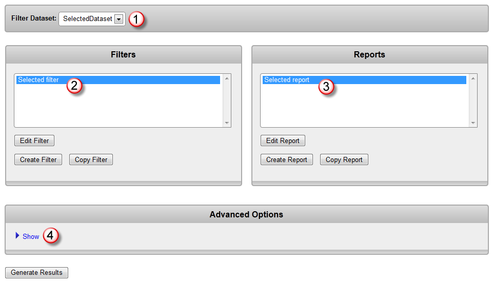
Select the filter dataset.
-
Select the filter to use for monitoring.
-
Select the report to use for monitoring.
-
Expand the "Advanced Options" window.
-
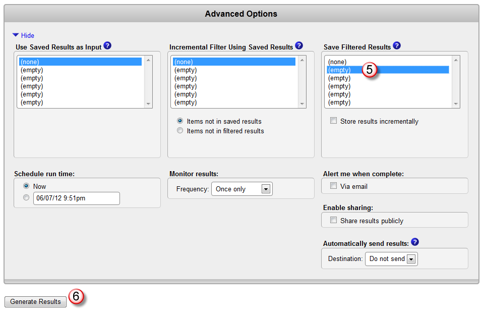
Select a slot to save all of your filtered results. This will become your baseline result set for comparison. Make sure the "Store results incrementally" box is NOT checked.
-
Generate the results and return to this page.
-
You now have a baseline to use for incremental filtering. Repeat steps 1 through 4 to select your filter and report that you want to monitor.
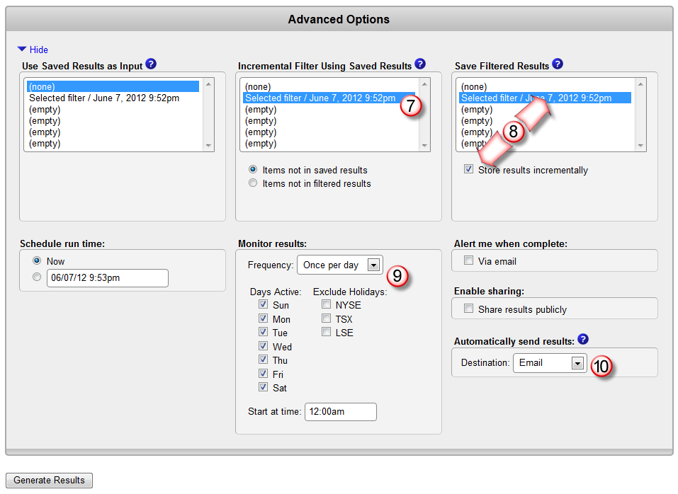
In the "Incremental Filter Using Saved Results" box, select the same results slot as in step 5. With this selection, your filter results will only contain those items that match the filter that are not present in this saved result set.
-
In the "Save Filtered Results" box, select the same results slot as in step 5. As in step 5, this selection will save the filter's results into the slot. This time, however, you'll want to check the "Store results incrementally" box, which means that the results from this current filtering operation will be merged with those that were already stored there - basically we're keeping a running record of all results that you've seen.
-
Set the frequency, start time, and similar options for your monitor.
-
Select your choice of alert method. Every time the monitor runs, you'll receive an alert only if there are any new results.
Finally, generate your results as above. You now have an automated alert system.
Note that if you have an empty filtered result slot, you can skip steps 5 and 6. The first time your monitor generates results, you'll see all of the matches, and then going forward, you'll only get the new results.
You can also use incremental filtering to alert you when items that were in the saved results aren't anymore. The only change to the procedure above is in the "Incremental Filter Using Saved Results" box - just select "Items not in filtered results". When your results are incrementally stored, the items that no longer match will be removed from the stored results.
If you'd like a more detailed walkthrough, please consult Tutorial #3, Part II.
Capturing data from a multipage API
Written by Jason on April 23, 2012The Internet is becoming increasingly friendly when it comes to data accessibility. More and more sites are providing APIs that make it easier for users to access data.
Easier however, doesn't always mean easy. If you want to analyze data coming from an API, it can be challenging to get it into a useful form. APIs vary from one another, with different input parameters and output formats. However, the biggest problem for many people is that the output often spans multiple pages.
We've shown you how Tuhunga can handle different parameters and formats in our tutorials. In this post, we'll show you how to handle the third challenge - using Tuhunga to capture API output that spans multiple pages in a single import.
Keep reading to see an example in action using the World Bank API.
Keep reading...Tags: examples, features, imports
Trimming to keep data neat
Written by Jason on April 11, 2012While we've discussed some of the various ways to import data into Tuhunga, we haven't spent much time writing about how we help you manage it. Today, we'll see how to keep your datasets manageable.
Just like a garden, there are times you'll want to pare back your datasets to keep them from growing uncontrollably. For instance, you may be using Tuhunga to keep a record of some data from the last three weeks, and aren't concerned with anything older than that. Or you simply may be reaching the storage limits of your membership, and want to cut some unused parts of a dataset without deleting the entire thing or having to upgrade your account.
Fortunately, this is extremely easy to do, and allows a great deal of flexibility. The same flexibility, in fact, that's available in the built-in analysis suite. Mainly because it uses the same filters. However, when trimming, instead of retrieving and displaying the data that's been found, it is removed.
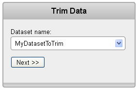
Let's see how easy it is. Select the trim feature from the dataset management area and choose the dataset to trim.
Now select the filter to apply. Remember -- anything that matches the filter criteria will be deleted.
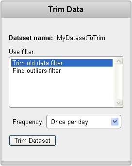
Note -- just like imports, trims can be automated and you can keep your dataset size from growing too much.
Confirm the trim, and let's look at our data status queue to see our trim results.

And that's all there is to it. Trimming gives you one more tool to manage your data.
Mashing data together
Written by Jason on March 18, 2012Mashing data together can be hard. There are lots of issues to deal with; to name just a few:
- different file formats
- different source locations
- different date formats & conventions
- sometimes even different characters as the decimal point
Today, we'll show you how Tuhunga handles these kinds of issues transparently for you. We'll use two datasets that are available to all members - the yearly commodity price dataset, and the World Bank agricultural dataset (one of the twelve that were recently added).
I mention these two because the commodity price dataset was originally in an Excel file, while the agricultural dataset came from an XML feed. The dates were stored in different formats. The agricultural dataset provided a breakdown by year and by country, while the commodity price data is purely time-dependent.
None of these are issues when using Tuhunga. Once the data is in the system, these issues no longer exist. The two datasets are tied together in a few clicks, and can be used as if they were one.
Let's take a look at the price of two major cereal crops - wheat and corn - and see if we can observe a response from farmers to changes in price:
Examining the chart, it seems like there is a supply response to changes in price. That is, in general, when both crop prices rise, there is an increase in land used in production either in the same year, or the following. Conversely, when prices fall, cropland area is stagnant or falls.
Note the outlier in cropland in 1992. Initially, it seems unlikely that there could be such a large increase in a single year and there might be an error in the underlying data. Fortunately, finding out what caused this discrepancy is easy - we simply create a filter to find countries that contained data in 1992 and did not in 1991.
It turns out that the step up was caused by the addition of the former Soviet bloc states to the dataset, as shown in green below.
Keep reading to see our adjustment for this discovery.
Keep reading...Tags: charts, datasets, examples
Lots of new developments
Written by Jason on March 9, 2012It's been a busy time here, and it's been too long since we last posted an update. As you may have seen already, we've been rolling out lots of improvements and productivity enhancements to make your analyses and visualizations better than ever. Here's a quick summary of some recent developments:
-
Fully integrated dashboards
- Build them with our easy-to-use graphical interface, and share them with a few clicks
- Lots more data that's ready for you to use
- The biggest addition are 12 datasets from the World Bank, comprising nearly 1000 individual data series
- An improved UI
- Nothing major - but we've made a few changes to make common tasks more efficient
- Tweak the appearance of analyses after they've been generated
- It may not seem like much, but when you're trying to get a "perfect" chart, being able to change its appearance after the analysis has been run will save you more time than you can believe.
-
A more powerful API
- Now create new fields and add new data imports to further automate your capture needs
- Of course, all the previous functionality is still there
- Greater system capacity
- You shouldn't even notice a difference. However, as your needs grow, we want to ensure that we're in a position to handle them.
Since there are so many new things, we'll review them over multiple posts, but we wanted to highlight the biggest new addition right now - integrated dashboards.
Historically, users needed their own website to build a dashboard (pages with more than a single table or chart). Now, they can create and share their dashboards all from within Tuhunga.
With an easy-to-use interface, you can select and format all of your output. And that includes being able to incorporate elements from other sites, so you can customize the dashboard's "look and feel" to match your own brand.
As February's employment situation report was released this morning, we thought we'd take a look at a sample dashboard reviewing the current labor status in some cyclical sectors of the US economy:
Note that the latest job openings and hiring data from the BLS is as of December. Also, we've set this dashboard to be static so it will always reflect the data available as of March 9th -- of course your dashboards can automatically update if you like.
Just as you would with individual tables and charts, you can embed a dashboard on your own web page. If you wanted to embed this dashboard on your own site, all you'd need to do is add the following to the page:
<iframe src="https://app.tuhunga.com/embeddashboard?key=2155f5824f917352" frameborder=0 width=100% height=800px></iframe>
Or, if you prefer, you can also let others see the dashboard by sending them this link:
https://app.tuhunga.com/embeddashboard?key=2155f5824f917352
Once we'd completed our four charts, it took less than five minutes to pull the dashboard together.
We hope you'll find our integrated dashboards make life a little easier. If you've got any questions or comments, please let us know.
Tags: features


