Dashboard tutorial video now available
Written by Jason on October 17, 2012If you've been looking for a video to help you get started with building a dashboard, look no longer. We just added a two minute demonstration to our tutorial library.
You can find it here:
http://help.tuhunga.com/customer/portal/articles/793882-introduction-to-dashboards
The dashboard video assumes that you've already built your analyses and want to pull them together into a dashboard. If you haven't already done this, you might find our introduction to analysis video useful.
Tags: examples
Get productive! Let our wizard guide you
Written by Jason on September 27, 2012Getting started with Tuhunga just became even easier!
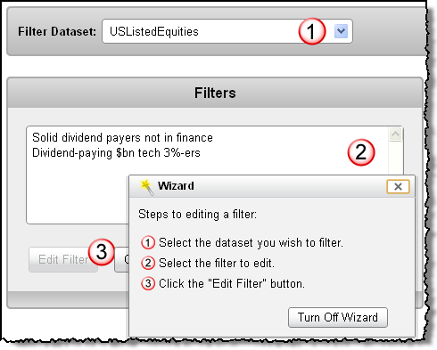
If you haven't used Tuhunga before, the Wizard augments our existing stock of videos and tutorials. It will step you through common tasks like adding data to your account, setting up an analysis, and sharing results with others.
You can start the Wizard on the main screens - just click on the "Launch Wizard" button.
Don't think that the Wizard introduction lets us off the hook though - as always, we're here to help you if you have any questions or want help in implementing your solution.

Tags: features
Major improvements in mapping data
Written by Jason on September 19, 2012We're pleased to introduce a number of new mapping capabilities that dramatically enhance both functionality and "curb appeal". If you ask us, the functionality improvement is as big a jump as from Web 1.0 to Web 2.0.
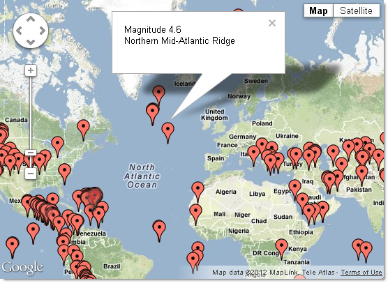
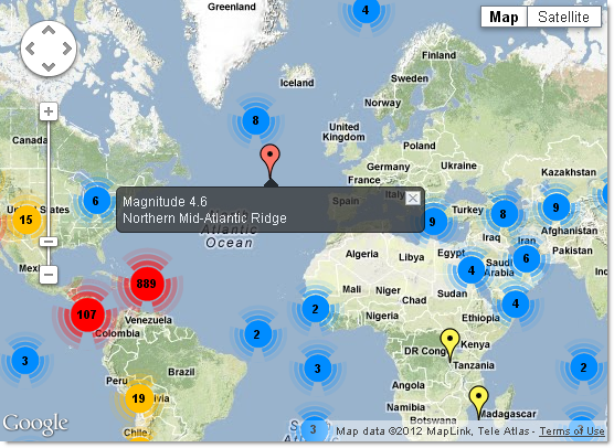
We'll detail all of the changes in a moment, but to start, let's just take a look at the "before" and "after" screenshots:
BEFORE

AFTER

The map enhancements include:
- Improving the display for large numbers of points with optional clustering (as shown above)
- Accelerating the drawing speed with large numbers of points by up to 100x (using clustering)
- Enabling custom icons for each and every single point (we kept it simple above and used different-colored pins)
- Geolocating and zooming for the user
- Setting the tooltip message (when a user hovers over a point) separately from the contents of the information window (when a user clicks on a point)
- Providing style options for the information windows
- Customizing which user controls are shown (e.g., street view, scale, map vs. satellite)
These enhancements apply to maps that use Latitude/Longitude coordinate pairs as well as those that use street addresses.
Plot states and provinces as regions
Written by Jason on September 12, 2012We're pleased to announce that Tuhunga now supports provincial/state-level geomaps for a large number of countries. And they're easy for you to create too! We created the map below in less than five minutes - which includes finding and importing the data.
Keep reading...Tutorial videos now available
Written by Jason on August 15, 2012We've been getting requests to augment our existing tutorials with some step by step videos to help people get started. With that in mind, we're pleased to announce the first three videos on how getting started with Tuhunga.
-
A four minute introduction to capturing data from an excel file and a web page. Also, how to automate the capture process and let Tuhunga keep your dataset updated.
http://help.tuhunga.com/customer/portal/articles/668189-introduction-to-importing-data -
A three minute video covering the basics of analysis. It uses the dataset from the capture video and shows you how to create a filter and report to target and visualize your data.
http://help.tuhunga.com/customer/portal/articles/670374-introduction-to-analysis -
An eleven minute video that walks you through a more complex scenario, again using the dataset from the first video. In this one, we'll show you how to analyze data that varies seasonally in the first six minutes. The balance covers improving the appearance of your charts.
http://help.tuhunga.com/customer/portal/articles/680756-analyzing-seasonal-data
We've got these three now, and we'll continue to add to the library, so if there are specific topics you'd like to see, please let us know.
Tags: examples
Plotting points with custom icons on a map
Written by Jason on July 4, 2012Fortunately using custom icons isn't much more difficult than plotting basic points on a map. To get started, you'll need:
- The latitude and longitude for each point
- The URLs for your custom icons (or use the ones we've provided - more detail below)
- Labels for your pins
- *optional* Descriptions for the contents of the callout when a pin is clicked
- *optional* Categories if you want to be able to control the points in groups
With these five items, you can create visualizations like this one:
Keep reading...

