Finding trend changes
Written by Jason on October 13, 2010As we’ve written about previously, Tuhunga can help find patterns in data series and alert users when they occur. We originally started discussing this topic here using foreign exchange rates. Also, tutorial #3 discusses how to build a monitoring system that alerts you when your custom criteria are met.
Today, we’re going to take it a step further and build an alert system that is triggered not off a level, or a change in the level, but a change in the trend. We’re also going to look at evaluating performance after the trigger event on a historical basis.
We’ll use the same daily foreign exchange data to search for what technical traders call the “golden cross.” That is, where a shorter-term moving average rises from beneath a longer-term moving average to above it, and is often considered a bullish sign. However, you don’t need to be an FX whiz to benefit from this kind of application – businesses with currency exposures can also benefit from understanding this trend to minimize costs.
We’ll demonstrate two applications today:
- Examine the Euro’s performance after a golden cross. We will determine the performance of the Euro against the US Dollar after a golden cross occurs using 30-day and 60-day moving averages.
- Automate detection of golden crosses going forward. We will want to receive notification of the event so we don’t need to keep checking for the event ourselves.
For this example, we’ll look for crosses from the beginning of 2008 through present, during which there have been eleven crosses:
Using these moving averages, over this period at least, the golden cross has been an effective indicator that the average exchange rate after a golden cross is higher, with 9 out of 11 trials in both one-week and four-week future periods higher than the day of the cross.
Everything we’ve done here can be modified to search for other indicators with stronger metrics and, of course, can also be applied in reverse on “death crosses” as well – which are the reverse of the golden cross.
After the jump, we’ll provide the filter and report details we used to construct the output, as well as how to configure Tuhunga to monitor the data so you receive an alert when there’s another cross.
Tags: analysis, examples, tables
New visualization options for faster rendering
Written by Jason on September 19, 2010You may have noticed that there are two versions of some chart types:
- Area vs. Area (Fast)
- Column vs. Column (Fast)
- Combo vs. Combo (Fast)
- Line vs. Line (Fast)
- Scatter vs. Scatter (Fast)
Just as their names would lead you to believe, the fast versions are FAST! They render dramatically faster than the other versions. If you are using any of the traditional types of charts with hundreds or thousands of data points, you should consider switching to the fast version.
We especially recommend you use these versions for embedding in a web page, as they can render over 100x faster. To put it into perspective, one large result set plotted using the traditional scatter chart took over two minutes to render for us. The new version took less than one second.
Most of the functionality of the traditional charts is available in the fast versions (and, in some instances, there's more!). Unfortunately, it's not quite all there, but we're almost there.
The biggest limitation of the fast charts (as of this writing) is if you want to download a high-res version of the chart to put in a presentation or other printed document. The traditional ones do a better job at this.
We'll keep both options available for now, but once the fast version supports all of the regular version's functionality, we'll migrate to it. If the fast version has all the features you need, we'd suggest you use it unless you prefer the look of the traditional chart.
Looking at the US employment picture
Written by Jason on September 6, 2010Today, we’re introducing the USLabor dataset, which is the first of a number of planned sets that will provide insight into the United States as a whole. It contains over 190 different data series with monthly data on employment, unemployment, average hours worked, overtime hours, average hourly earnings, hiring, job openings, layoffs and population. Employment, average hours, average earnings, hiring, job openings and layoffs are further segmented by industry, while unemployment is further broken down into different period lengths. Some of this data goes as far back as 1939.
For the statistically-inclined, this set is a compilation of what we felt were the most commonly-used items found in The Employment Situation and JOLTS (Job Openings and Labor Turnover Survey).
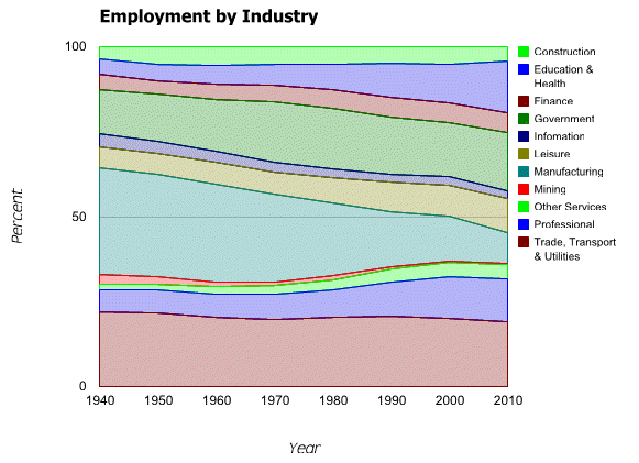
We’ll use the set to demonstrate stacked graphs. While we will use a stacked area graph to show the changing labor force mix over the last seventy years, note that bar and column graphs can also be stacked.

Clearly manufacturing employment as a proportion of the total has declined, while Education & Health, Professional and Government have grown.
We’re also going to compare the 2010 seasonal adjustments to nonfarm payrolls against 2009 and the historical averages. As you may remember from earlier posts, we’ve used aggregation functions to calculate rolling sums of failed bank assets and standard deviations of natural gas inventories. This time, we’ll generate a column chart that compares the nonfarm payroll seasonal adjustments of each of the first eight months of 2010 with those of 2009, and the mean adjustment in each of those months for the past five years.
Note that the above isn’t intended to be a rigorous analysis that adjusts for changes in the size of the workforce, holidays, etc. But what we do find interesting about it is the size of the differences between this year’s adjustments versus the historical ones. When the Employment Report comes out on the first Friday of each month, it is often a “market moving” event, with beats or misses to consensus estimates often measured in increments of ten- or twenty-thousand. Yet the seasonal adjustments regularly differ by more than twice that amount, either from year-to-year, or off the mean. When a forecaster doesn’t have a strong grasp of the seasonal adjustment process, it is easy to see how it can be a significant source of error.
Next, we’ll show an interactive table with the cumulative mix changes by starting year from 1940 through 2010, as well as a link to download the results to your computer. As always, we’ll also provide instructions on how to replicate these analyses yourself.
Keep reading...Tags: analysis, charts, datasets, examples
Plot points on a map - you can do that too!
Written by Jason on September 2, 2010Today, we’ll highlight a different type of dataset – earthquakes. This dataset is built from U.S. Geological Survey data and contains all magnitude 1+ earthquakes from around the world starting from early August 2010. There are a lot of them. You can add this dataset to your account under the Subscribe tab at no cost.
For this example, we’re going to highlight magnitude 3+ earthquakes in the San Francisco Bay area. Specifically, we want to see any 3+ magnitude earthquakes within a 400km square with San Francisco at the center, and we want to plot them on a map so it’s easy to read. We build our simple filter and report and are able to generate this map in about five minutes:
Let's go through the details on how we generated these results.
Keep reading...Tags: charts, datasets, examples
Visualizing data with heatmaps
Written by Jason on August 24, 2010We’re going to introduce a new dataset for today’s example. Much of the data from the CIA’s World Factbook is available at Tuhunga for free, and we’re going to use it to demonstrate heatmaps. In this example, we’re going to visually compare the population of a country against the population growth rate.
Specifically, we’re going to plot the population as the size of the box, and the rate of change as the color. But, of course, the size and color can be any numeric data you wish. In the example below, we show the ten most populous countries in the world, and underneath, we’ll up the chart to show all the countries with populations over ten million to demonstrate how large sets are drawn.
Keep reading...Tags: analysis, charts, examples
Using standard deviation to find uncommon events
Written by Jason on August 21, 2010In our previous post, we created a sparkline dashboard that let us monitor a large number of data series at a glance. Today, we’ll increase the analysis a notch by comparing natural gas inventories not only to their five-year mean, but also their standard deviation, with an eye to finding when inventories were outside one standard deviation from the mean.
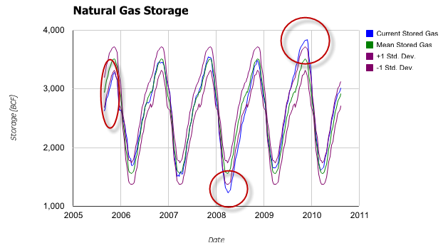
As before, we’ll start with a traditional scatter graph containing the current price, the five-year mean computed by week, and a +/- 1 standard deviation envelope around the mean.

The graph clearly shows the cyclical nature of the inventory levels. However, it’s less obvious when the levels go outside the envelope we’ve drawn – we’ve highlighted the three significant occurrences.
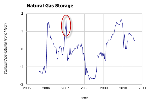
Might there be a better way to find and depict these relatively uncommon events? Yes – we’ll normalize the data so we only need to plot a single series of current distance from mean in units of standard deviation – and avoid cluttering the graph.

The deviations are now quite clear. However, more importantly, we can now see a fourth spike outside our +/- 1 standard deviation window that was completely obscured in the first graph.
Tuhunga is useful in helping to find and display both trends, and trend aberrations. However, where Tuhunga can really improve your productivity is by building a filter to extract these uncommon events and then having it run automatically. For members with automated monitoring, Tuhunga will automatically run your filter, and when new data that meets your criteria is available, it will generate a report and email it to you. Not only does automated monitoring save you time by freeing you from manual updates, it also allows you to search for trends and events that you normally wouldn’t look for because there wasn’t enough time in the day. Tutorial #3, Part II covers this feature.
Keep reading...Tags: analysis, charts, examples


